App and API highlights: Messages
Andrew Cunningham
Once you start adding stickers and reactions and emoji to everything the Messages window can get a little chaotic.
-

Andrew Cunningham
Once you start adding stickers and reactions and emoji to everything the Messages window can get a little chaotic.
-

Andrew Cunningham
Links get expanded with image previews and everything, which looks way better than a long garbled link.
-

Andrew Cunningham
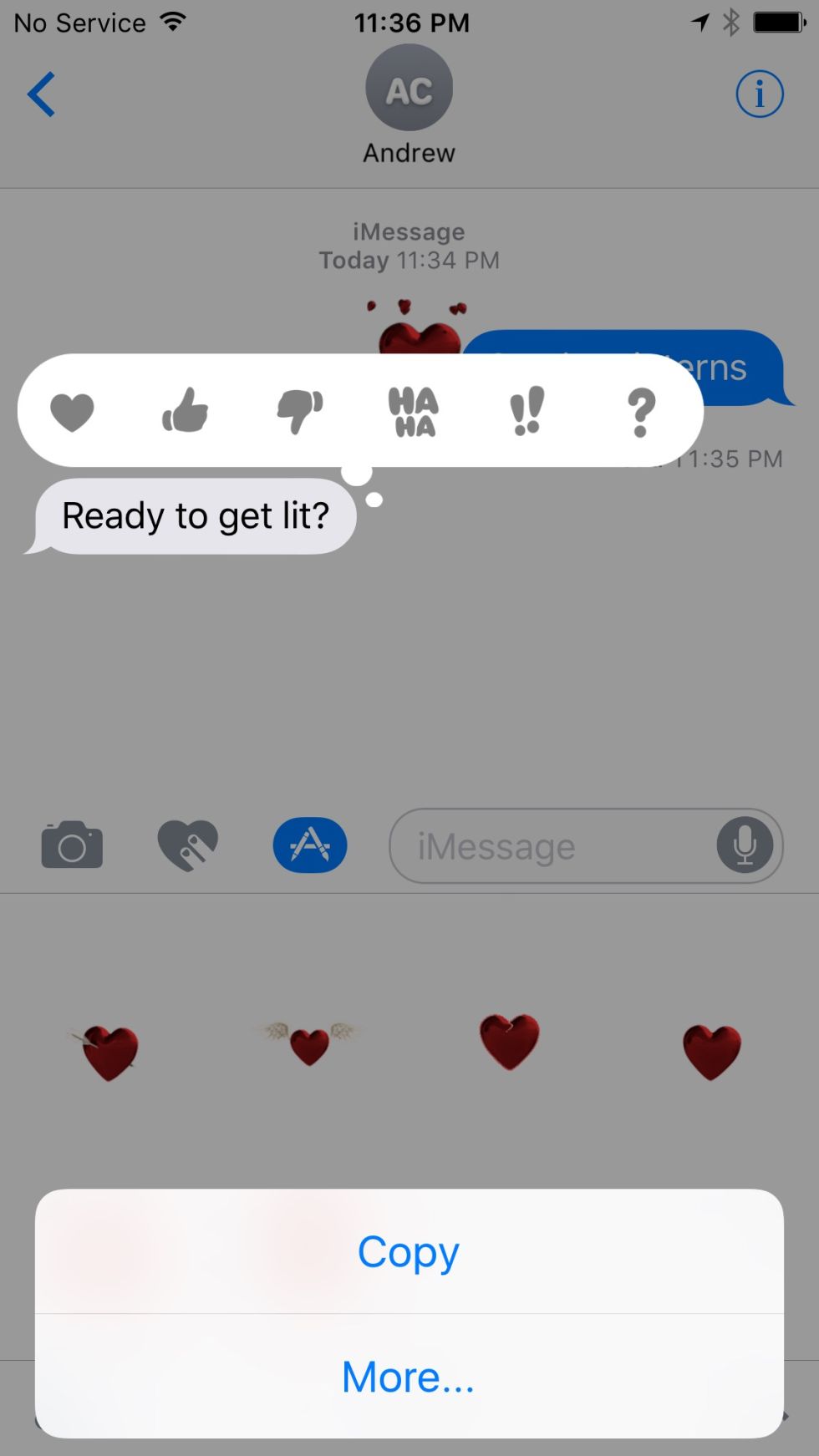
Adding reactions to a message.
-

Andrew Cunningham
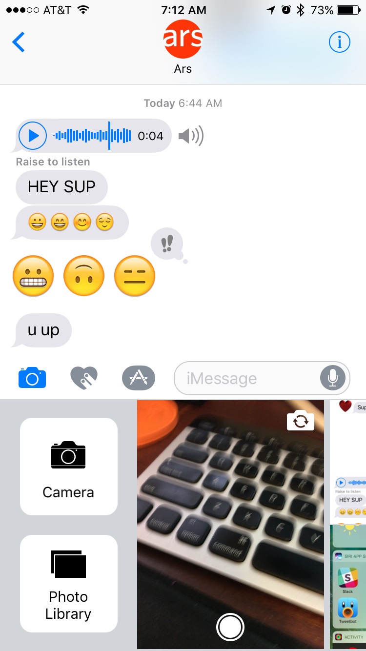
The new photo picker is good. Take a new picture with your camera using the little live thumbnail, swipe left to see images in your photo library, and swipe right to see launch shortcuts for the full Camera and Photos apps.
-

Andrew Cunningham
Searching through images and GIFs.
-

Andrew Cunningham
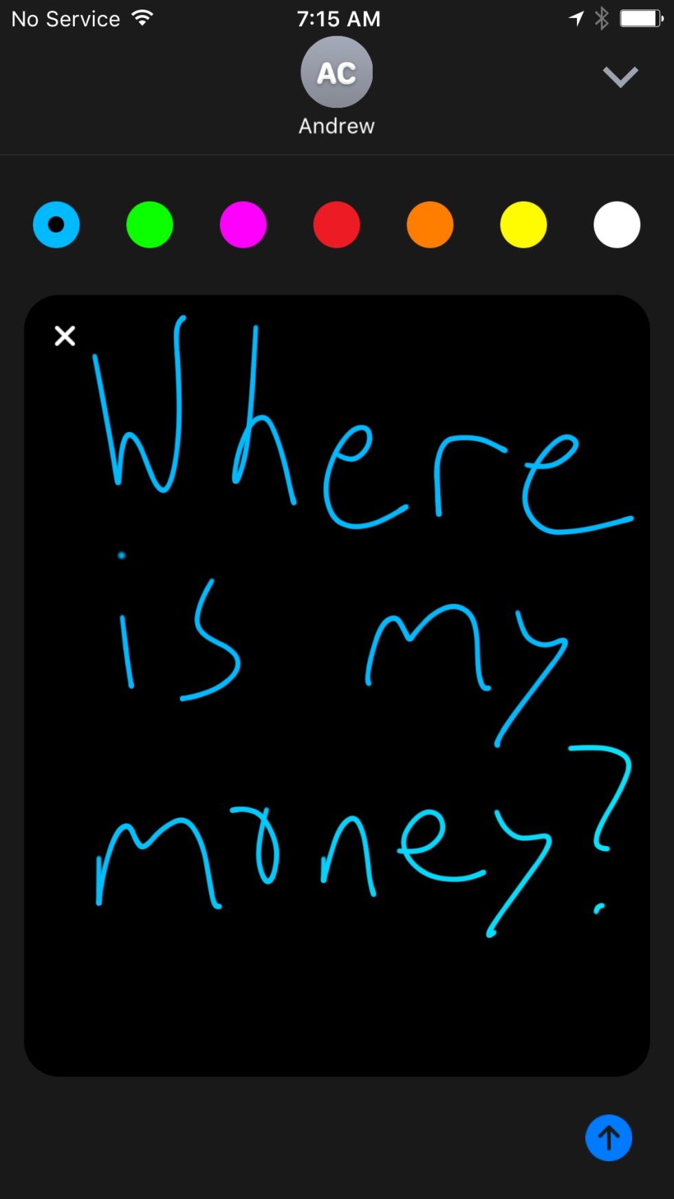
You can draw and use small figure gestures to send messages to other people—this is a lot like the comparable feature in the Apple Watch.
-

Andrew Cunningham
Writing a longer message.
-

Andrew Cunningham
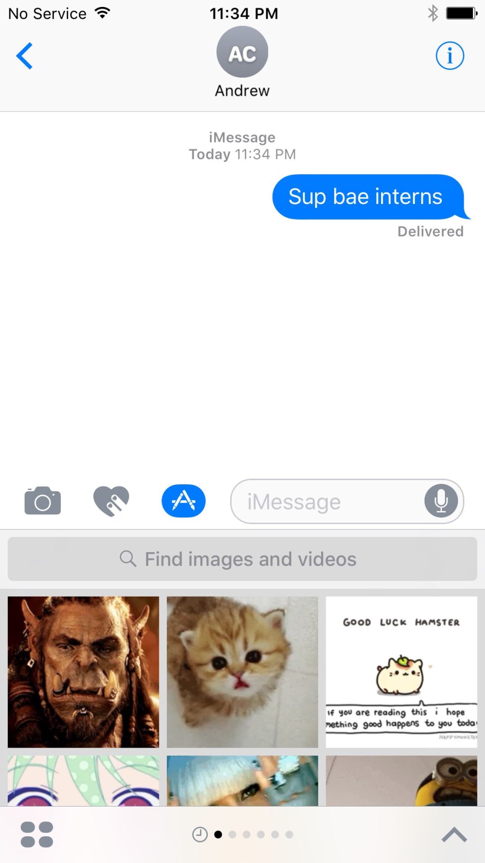
The iMessage app store is pretty sparse right this second.
-

Andrew Cunningham
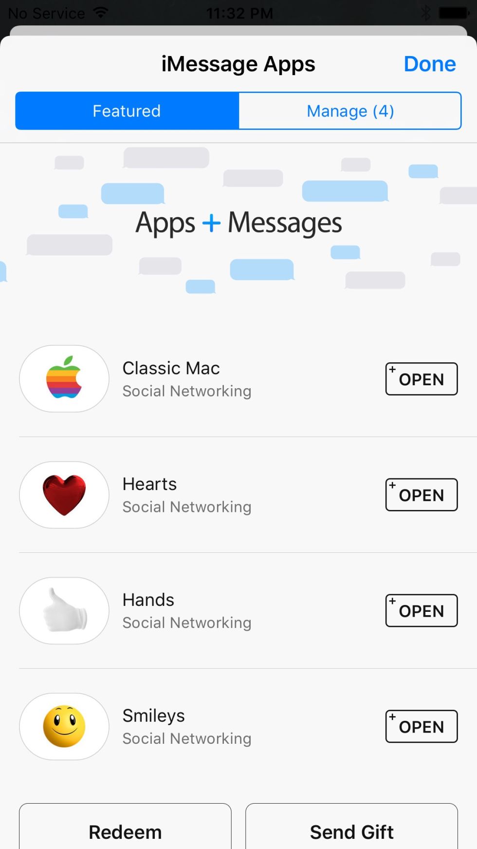
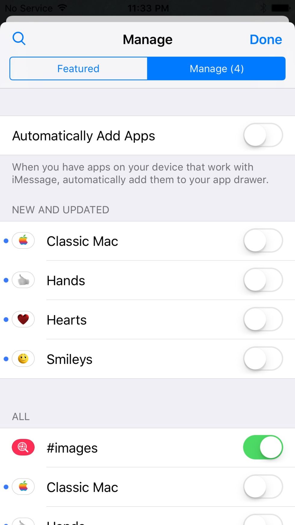
Apps aren't added to your app drawer automatically to avoid cluttering iMessage. You can enable apps manually or toggle that behavior.
-

Andrew Cunningham
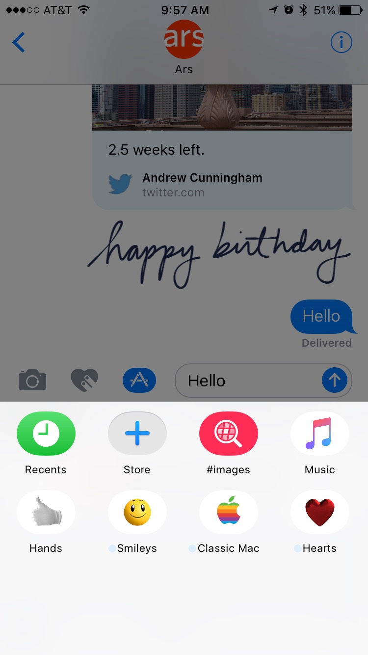
The iMessage app drawer. You'll see apps you've enabled here, and you can go to the Store to download and enable more.
-

Andrew Cunningham
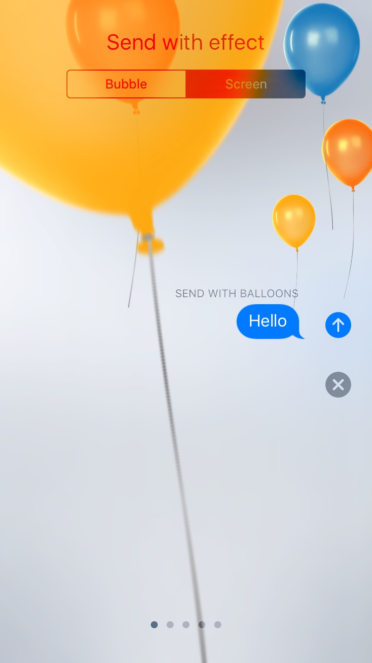
Full-screen balloon effect. These screens are all fully animated.
-

Andrew Cunningham
Confetti effect.
-

Andrew Cunningham
Laser light show effect.
-

Andrew Cunningham
Fireworks effect.
-

Andrew Cunningham
Shooting star effect.
-

Andrew Cunningham
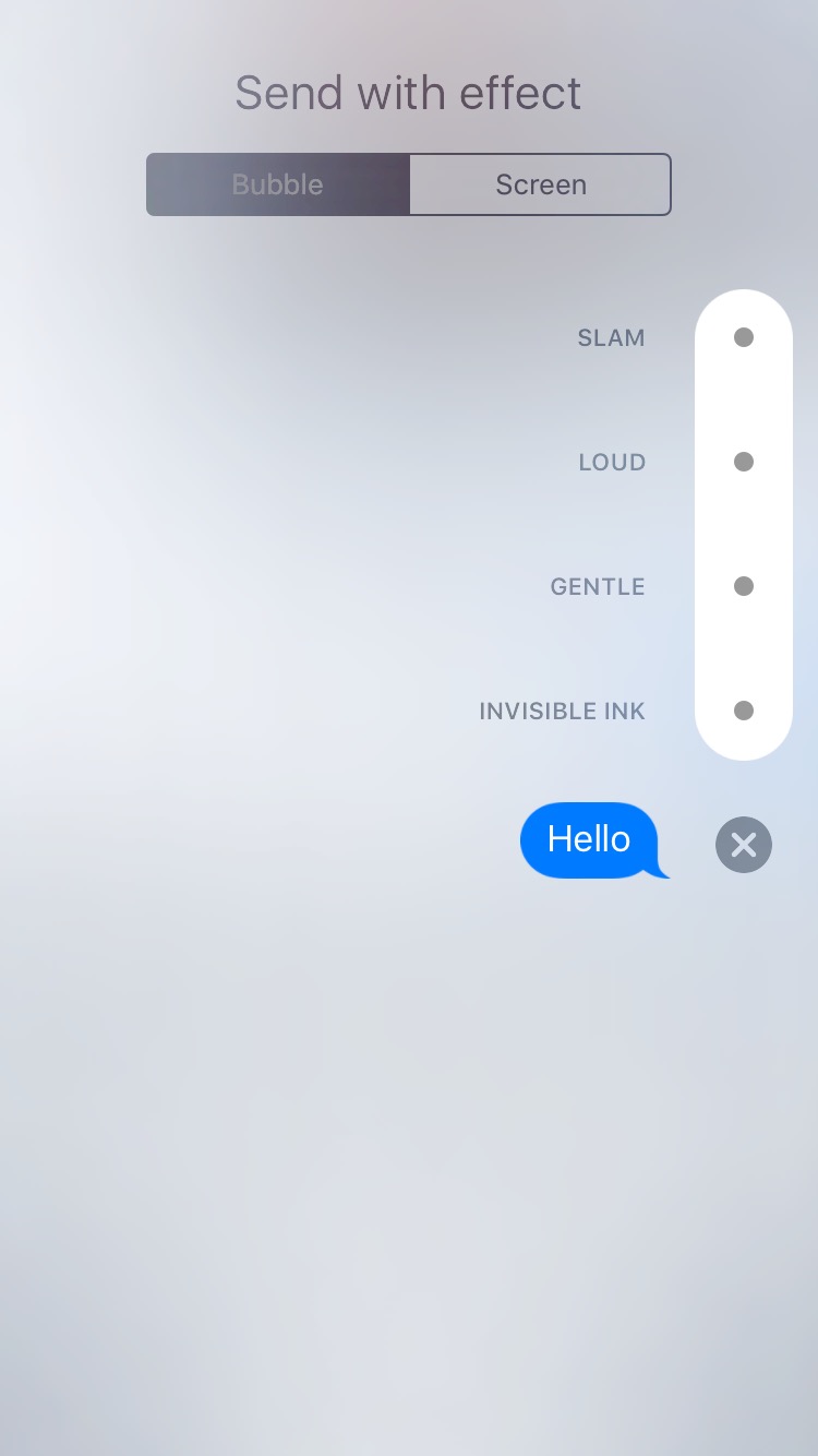
And you can tweak the way the bubbles themselves look, too.
Of all iOS 10’s built-in apps, the one that is the most radically transformed is Messages. Over the years it hasn’t strayed far from its roots in the old Mac OS X iChat app, a low-to-no-frills communication app that eventually merged into/was replaced by Messages many years later. But iOS 10 remakes it in the mold of newer, busier apps like Facebook Messenger, and it picks up a whole lot of new visual frills alongside its new features.
Messages can now automatically expand links when you send them, much as Facebook or Slack does—your recipients will now see a clean thumbnail with a bit of preview content rather than a big messy blue link. And the interface for selecting and snapping pictures to send to people has been streamlined, too—hit the arrow button to the left of the text field and then hit the camera, and you can easily swipe horizontally through your camera roll or use the thumbnail-sized camera preview to take a new picture. Tap on that thumbnail or swipe all the way to the left to open the classic full screen photo album and camera views.
iMessage apps are one rung down the usefulness ladder from those first two changes, but as pitched they still sound sort of promising. They're supposed to do app-y things without actually making you jump into another app, and for chats where transactions or social scheduling are going on this could prove interesting. Apple’s examples include sending someone money through Venmo or some Venmo-esque service, or agreeing on showtimes and then buying movie tickets through Fandango.
Apps that the person on the other end of the conversation will need to download to use will be offered up for download if both parties don’t already have them. Mac users running Sierra ought to just get a link—remember,
Messages for Sierra can view most of the stuff that the iOS app can send (stickers included), but macOS can’t send most of this stuff.
And then we get to the other kind of iMessage app: stickers. Stickers you’ve bought can be stuck to any message that your or your recipient has sent to add and add some personality to the conversation. If you send stickers to an iOS 9 user or someone who isn’t on iMessage, they’ll just go through as regular old images.
Hit the App Store icon to bring up the UI for iMessage apps, which can also be delivered as extensions within regular apps. They’ll have their own Apple Watch-esque app store, which is currently populated with a handful of Apple-made sticker packs but not much else. As with widgets or Share extensions, iMessage apps you download won’t automatically show up in the main app by default to prevent it from getting too cluttered. Go to the “manage” tab of the store to toggle iMessage apps on and off (or change this behavior, if you just want all of your apps to show up all the time).
Once you have a few apps selected, go to send an iMessage and then hit the App Store icon again. Swipe left and right to change between apps or sticker packs and up and down to scroll through a particular app or sticker pack.
For adding personality to messages without adding apps, start typing a message and then long-press the blue “send” button that appears to the right of the text field. From here, you can select several different bubble styles and background effects, most of which are demonstrated better in the pictures above than they would be in text.
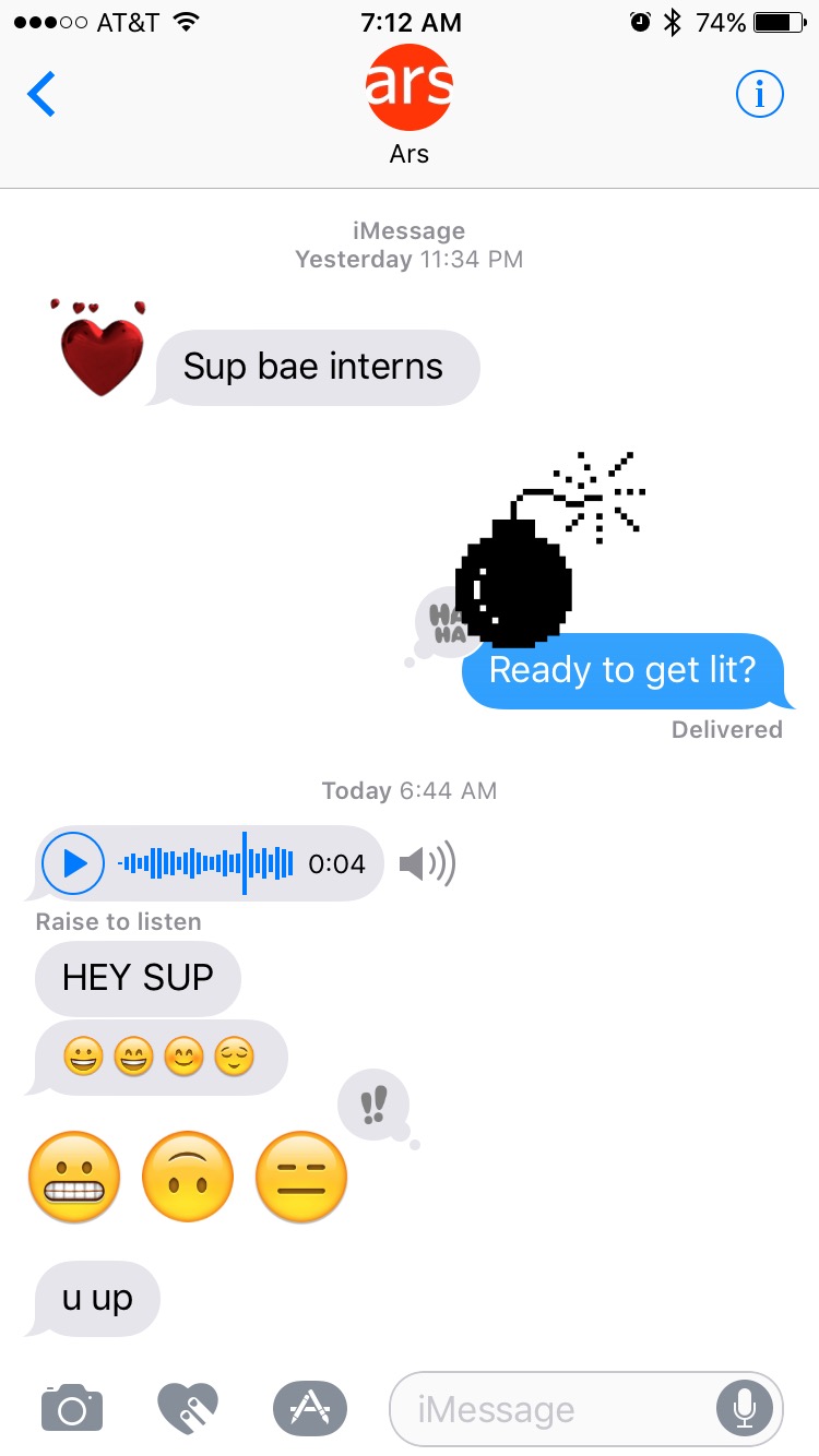
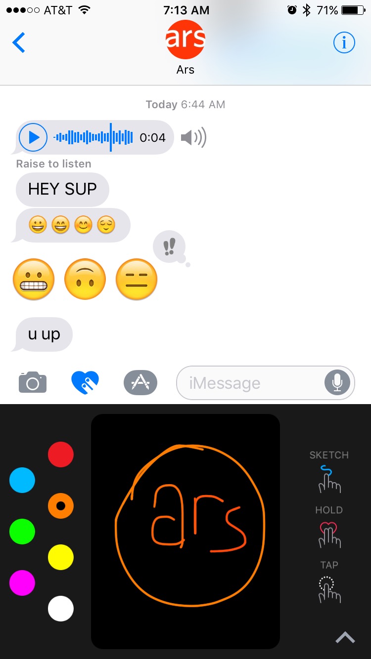
Other cosmetic additions that don’t require App Store purchases include “reactions,” brought up by long-pressing on a message bubble and adding one of six canned pre-defined reactions; handwriting mode, in which you flip your phone sideways and then scrawl something out with your finger; larger emoji for when you’re sending messages with
just one-to-three emoji in them; and an Apple Watch-esque mode for drawing pictures and messages and sending little animations out to your friends. There’s also a distinctly Facebook Messenger-esque image searching feature that makes it easier to find choice reaction GIFs when you need them.
Most of the changes in Messages could reasonably be described as “juvenile,” insofar as they’re a departure from the Messages app’s heretofore straightforward just-the-basics design. But they reflect the kinds of features that are showing up in competing messaging apps and the things the users of those apps are actually using. Once any given group of people—whether that’s a group of friends in Facebook Messenger or a group of coworkers in Slack–discover the goofy little things that their messaging clients will let them do, they’ll start using those features. Apple has done a pretty good job giving Messages some goofy little things to do, and hopefully more “serious” iMessage apps will make actually getting things done a bit easier, too.
Mail
Andrew Cunningham
Viewing folders from the top level of the Mail app. Expand and collapse your accounts as you need to.
-

Andrew Cunningham
Viewing folders from the top level of the Mail app. Expand and collapse your accounts as you need to.
-

Andrew Cunningham
The filter icon in the lower-left corner (filled in blue when enabled, as pictured).
-

Andrew Cunningham
Different quick filter options.
-

Andrew Cunningham
The top message in a new e-mail thread.
-

Andrew Cunningham
Scroll up and down to see other messages in the thread. But you can see below Sam's e-mail that Mail isn't always great at collapsing quoted replies, which can make scrolling a problem.
-

Andrew Cunningham
A properly collapsed e-mail.
-

Andrew Cunningham
Swipe left to view the same quick actions as you had before.
-

Andrew Cunningham
Ditto for swiping right.
I’ve always been a stalwart user of the iOS Mail app—I’ve tried other clients as they’ve come out, but I prefer to handle all my mobile e-mail from the same app (making Google’s Gmail/Inbox and Microsoft’s Outlook apps less-than-desirable). Besides, the best third-party e-mail apps are either getting
bought by Google or
shut down and Apple doesn’t let those clients do everything that the first-party client can do anyway. It’s easier just to stick with something safe.
Mail in iOS 10 doesn’t get any huge overhauls but it does make a handful of tweaks, some of which are immediately useful and others that might one day be useful if Apple can address some irritating corner cases.
On the “useful” end of the spectrum: the Mailboxes view now shows all the folders in a given mailbox at the top level of the app rather than making you dig through separate screens when you have multiple accounts set up; tapping the name of each account expands or collapses the list if you prefer a cleaner view or just don’t want to scroll through all the folders in every one of your accounts.
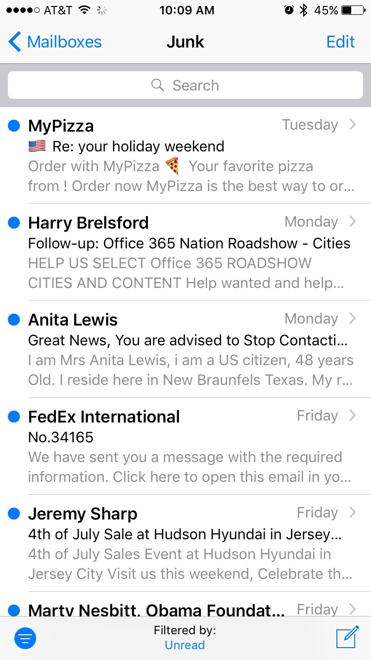
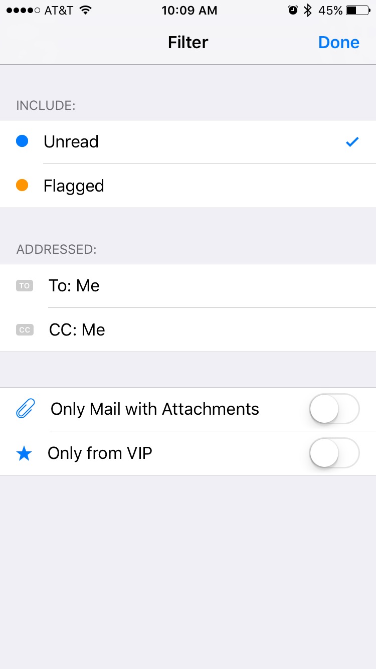
Also useful is the new quick filter, the circular icon with three lines in it that you can see in the lower-left corner of the screen. It’s a quick toggle for a few common filters that you could already use at the top level of the app. By default, you can quickly filter out all but your unread messages. Tap the “filtered by” label at the bottom of the screen to filter e-mails that have been flagged, those that are addressed to you directly, those on which you have been CC’d, and to toggle sorting by attachments and sender VIP status.
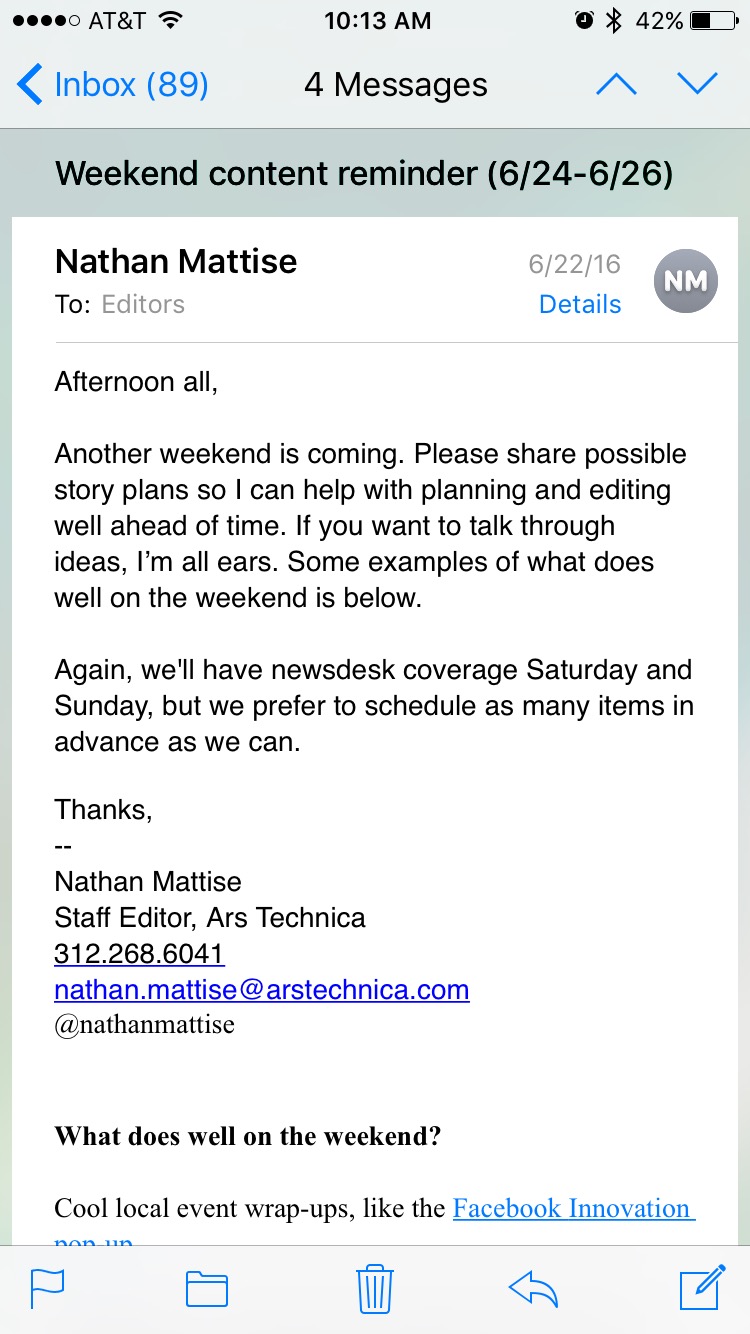
The Mail app offers a new threaded view that mirrors the one in Mail.app for macOS. Instead of poking through one message at a time, you can scroll up and down to see all messages in a thread (including your replies).
As much as I like the move to a threaded view in theory, in practice I ran into a few problems. The first was with how the app handles quoted messages included in replies. The app tries to collapse quoted messages automatically, allowing you to click a button to expand the quotes if you want but otherwise hiding them from view. The main problem is that it doesn’t always hide the quotes, and that all or part of old e-mail threads are sometimes included with each new message. (There is, of course, no help for those hopeless people who choose to reply inline, but that’s not Apple’s fault.)
Based on my limited data, I can say that quotes from my Gmail messages were more reliably collapsed than quotes from the Office 365 Exchange server that Ars uses. And the behavior appears to differ based on the e-mail client on the sender’s end and how it handles quotes—some quotes from Exchange messages were collapsed properly, and others weren’t. Based on some brief chats with co-workers and my own testing I'm inclined to blame Outlook for Mac as the main problem, but Mail may struggle with messages sent from other clients as well.
This is all annoying enough that I'll probably end up turning off threading in the settings unless Apple or the developers of third-party e-mail clients can tweak the behavior as the betas continue to roll out. Otherwise it can consume way more time than it saves.
The other problem I had was that all messages in a thread aren’t loaded up automatically when you open that thread. Messages load as you scroll, which even on a fast Wi-Fi network introduces some lag (and some scrolling confusion, since you’re not sure how long a given message will be until it’s loaded).
This makes some sense as a bandwidth-saving measure—you won’t necessarily want to reload every single message in a thread just to see the most recent reply. But some kind of option to automatically download and display all messages in a thread while the phone is on Wi-Fi could help improve the app’s responsiveness.
Siri’s API
Apple is providing developers with a Siri API in iOS 10, though admittedly it’s pretty limited in terms of what apps can use it and what those apps can use it
for. I'll quickly recap how it works in theory and we’ll take a closer look at how it works in practice when the final version of the software is released.
SiriKit provides developers of certain kinds of apps access to Siri while still holding them at arm's length with clearly defined rules and limitations. Third parties can use Siri in
six different kinds of apps, though those applications encompass a wide range of common and popular App Store offerings: audio and video calling apps, messaging apps, payment apps, apps that allow searching through photo libraries, workout apps, and ride-booking apps.
That covers a lot of ground, but there's a lot that's missing: music and video apps like Spotify and Netflix, mapping apps like Google Maps, and third-party to-do list apps don't fall under any of these umbrellas, possibly because they conflict too directly in some cases with Apple apps and services like Apple Maps and Apple Music (Apple Maps in particular is becoming more deeply integrated into the OS with every new update). Hopefully Siri will become more useful to a wider variety of apps later on, much as Apple has done with the extensions system it introduced in iOS 8. But for now the first-party apps are definitely still in a privileged position.
The backend for Siri handles the speech-to-text translation, and Apple provides its default Siri UI for responses and confirmation messages (though developers are free to customize their own). Developers can define custom vocabulary for their apps to improve Siri’s ability to understand what you’re asking for or to interpret names of contacts from within your app.
For those of you more interested in the technical underpinnings of SiriKit, we’ve got an explainer
here and Apple’s developer documentation is
here.
Home
The Home app is the friendly face that the HomeKit framework has been crying out for since it was introduced. It gives you a UI for controlling individual devices, grouping those devices into rooms, defining presets based on activities (“going to bed,” “watching a movie,” etc.), managing multiple homes, and inviting other users to view and manage those homes and devices. The “automation” option can control devices and groups of devices based on what time it is and where you are—maybe you want to confirm that your blinds are closed and your door is locked once you’ve arrived at work, or you want to turn on the air conditioner once you’re within a few blocks of your house.
If you want to communicate with your smart accessories while you’re away, you’ll need to have a device on your home network that serves as a bridge between that network and your device. An Apple TV signed into your iCloud account is the preferred hub, since it’s always connected to power and always available on your network. But head into the Home settings on any iPad running iOS 10, and you’ll also be able to use tablets as hubs as long as the tablet is at home and on the network.
As of iOS 10, HomeKit can support compatible air conditioners, air purifiers, humidifiers, cameras, and doorbells. Previously supported devices like fans, garage doors, lights, locks, outlets, security systems, motion sensors, thermostats, and window shades are still supported, too.
Until now, communicating with HomeKit accessories has primarily been accomplished via Siri. Now there’s a fairly elegant app for it that ships with iOS. It feels like a recommitment to HomeKit on Apple’s part, and for the sake of the
hopelessly fragmented security-flaw-ridden garbage-y Internet of Things ecosystem, I hope Apple is able to bring more manufacturers and devices under its banner.
I’m hoping to outfit the house we just bought with (a sensible number of non-terrible) HomeKit-compatible smart accessories. By the time the full version of iOS 10 is available, I should have more firsthand information to share with you about how the Home app works.


Comments
Post a Comment