Track and analyze the COVID-19 pandemic with KNIME
on
Get link
Facebook
X
Pinterest
Email
Other Apps
Paolo Tamagnini and Rosaria Silipo
15-18 minutes
Download KNIME’s guided analytics
dashboard to visualize the latest COVID-19 data, or try the entire KNIME
Analytics Platform workflow
da-kuk / Getty Images
We are all familiar with this chart by now. KNIME
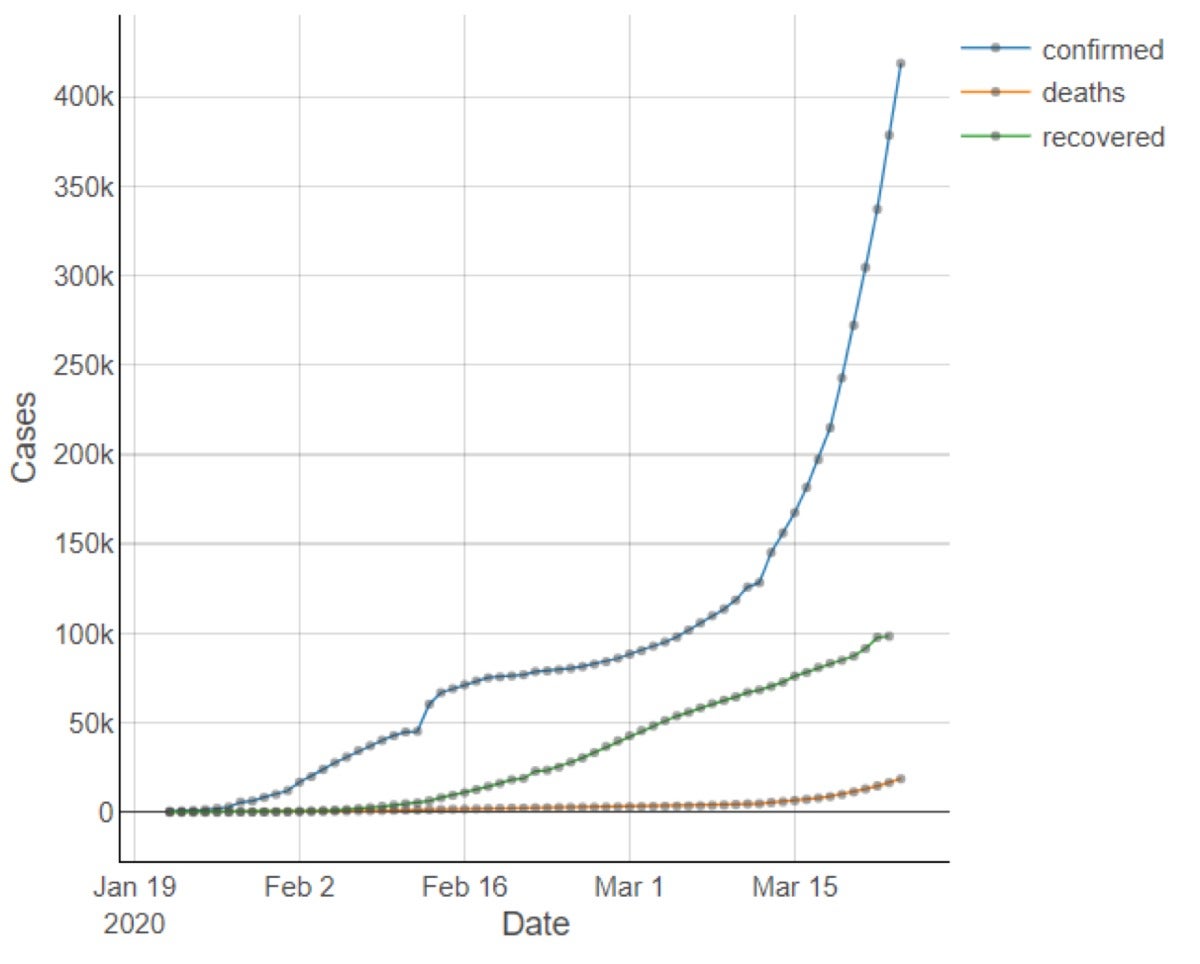
Figure 1. Cumulative numbers of confirmed COVID-19 cases, deaths due to COVID-19, and recoveries by day worldwide. With the increasingly rapid spread of COVID-19 all around
the world, we have read and heard much about how contagious it is; its
impact on China, Iran, South Korea, Italy, and elsewhere; and the severe
containment measures adopted. And we have seen many versions of this
chart, monitoring the spread of the disease daily by counting the
cumulative number of confirmed cases, deaths, and recoveries all over
the world.
An informative breakdown of these numbers can be found in the widely visited blog post “Coronavirus: Why You Must Act Now” by Tomas Pueyo,
published on March 10, 2020. There, the dramatic differences between
the spread of the disease within China and outside China show how
effective the containment measures in China were and the danger that the
coronavirus poses to the the U.S., Iran, Italy, and the rest of the
world. Two weeks later, how has the situation evolved?
We have
reproduced this line plot and other charts in a free-to-download web
application that allows you to drill down on the data behind the
COVID-19 pandemic. Unfortunately, we cannot say that the situation has
improved for the better. We have seen a sharp increase of confirmed
cases in March. We broke down these numbers to explore the situation by
continent and by country.
How COVID-19 is impacting the tech industry
Volume 0%
COVID-19 in Asia
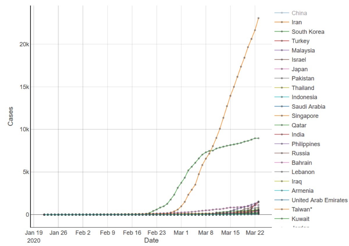
Let’s
start with a breakdown of the data in Asia, where the epidemic started.
The cumulative numbers of confirmed COVID-19 cases by country in Asia,
updated to March 23, are shown in Figure 2a. China’s curve has been
removed from the plot since its very high number of confirmed cases
prevents us from seeing the trends in the other Asian countries. KNIME
Figure 2a. Cumulative numbers of confirmed COVID-19 cases by day across countries in Asia, without China. Figure 2a shows the high number of cases in South Korea and
Iran. The flattening of South Korea’s curve, started at the beginning of
March, has continued over the past two weeks and gives hope to all
other countries still fighting the virus. Lockdown and people tracking
measures have been enforced in South Korea since February 20.
Apparently, it took 10 to 14 days before the effects of such measures
showed up in the plot.
Even after removing China’s data, the high
range of the numbers for South Korea and Iran makes it hard to see what
is happening in the other countries. For better visibility into the
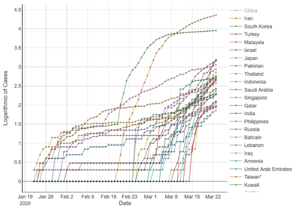
details, this same line plot was moved to a logarithmic scale on the
y-axis (Figure 2b). Here the trends for all countries, not just South
Korea and Iran, can be seen more easily. Notice that in a logarithmic
scale everything becomes less dramatic: Exponential curves become lines,
and the slower growth becomes more evident. For example, we can see
that the growth in the number of confirmed cases in South Korea has
decreased more than in Japan, even though the two ranges of cumulative
numbers are quite far apart.
The investigation of the curves for
Asian countries is a quite important piece of the puzzle since these
countries were affected earlier on by the epidemic and therefore have
longer experience in handling it. By checking these curves, we can learn
more about the spread of the disease and the effectiveness of the
containment measures.
For South Korea, the onset of the epidemic
can be dated back to around January 20; a huge increase followed in
mid-February until the slowdown commenced at the beginning of March.
Again, this indicates a time span of roughly two weeks before
containment measures took effect.
Japan’s curve starts a bit
earlier; it grows similarly to the curve of South Korea at the
beginning, accelerates at the beginning of February, continues to grow
slowly but steadily for a while, and looks as if it is flattening just
now as well.
Moving west, we see the insurgence of the epidemic in
the Middle East, mainly in Iran. The spread of the disease there starts
later than in the Far East, but it follows the same dramatic trend with
no hint of slowing down, for now.
The epidemic has recently also
exploded in Malaysia and Turkey. Their trends of confirmed cases look
similar to the initial curve of South Korea and Iran. Only time will
tell which direction they will move. KNIME
Figure 2b. Logarithmic scale of cumulative numbers of confirmed COVID-19 cases by day across countries in Asia, without China.
COVID-19 in Europe
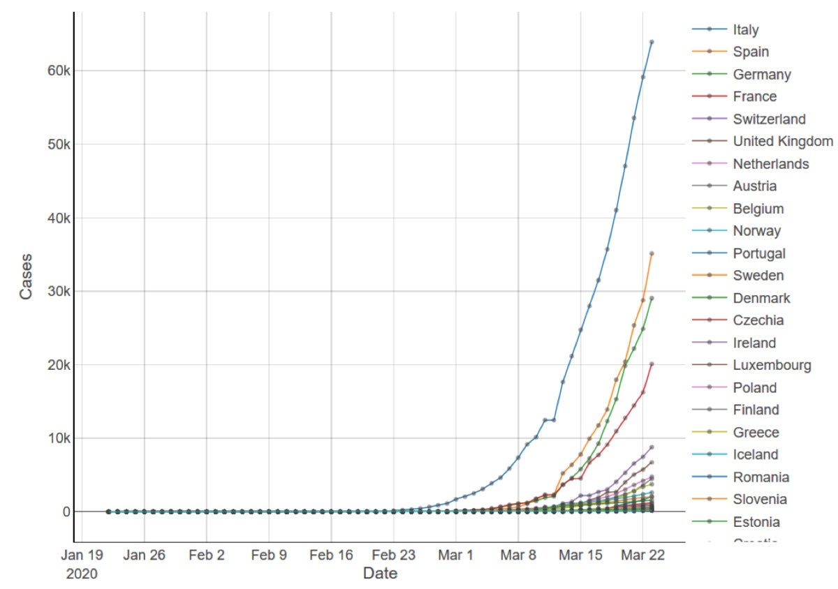
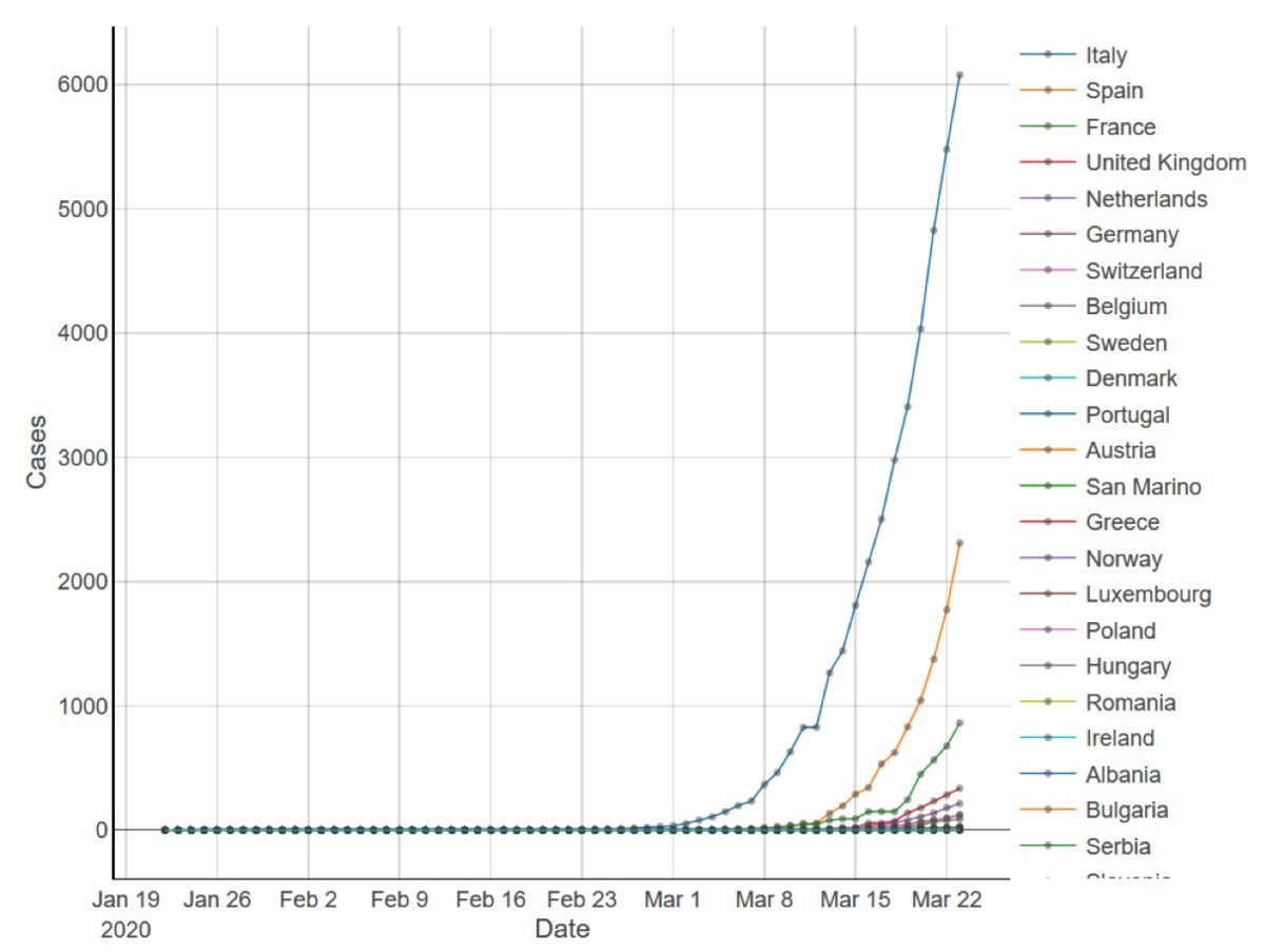
Figure 3a, below, shows the
dramatic situation in Europe, where Italy suffers the highest number of
confirmed cases (from 25K to 60K in a week). Severe lockdown measures
have been implemented in Italy starting in early March, initially in a
milder form but stepping up in strictness from March 9. The effects of
such measures do not seem to have entered the curve in the plot yet.
Similar measures have been introduced in the past few days in Spain,
France, Germany, and most other European countries. KNIME
Figure 3a. Cumulative numbers of confirmed COVID-19 cases by day across countries in Europe. However, numbers about the spread of the contagion do not
tell the whole story. The other face of an epidemic is its lethality,
i.e., the number of deaths. A similar plot to the one in Figure 3a is
shown in Figure 3b. This time, on the y-axis we see the cumulative
number of deaths due to COVID-19 as opposed to the number of confirmed
cases. This plot is similar to the one in Figure 3a, with Italy paying
the largest toll in terms of number of deaths.
In other European
countries, with a later onset of the epidemic, the disease is showing a
considerable increase in the number of deaths, as in Spain and France,
while for whatever reason, it does not seem to be as lethal in Germany. KNIME
Figure 3b. Cumulative numbers of deaths due to COVID-19 by day across countries in Europe. The steep rise of Italy’s curve indicating the number of
confirmed cases is not the only worrisome aspect of the plot in Figure
3a. Note that Germany, France, and Spain are the next countries in line
for the exponential spreading of the contagion. Their curves seem to be
following Italy’s curve closely; they are just delayed in time.
Containment measures have been enforced in these countries in the last
few days, following Italy’s lead two weeks ago. It is definitely too
early to see any effect in the plots. [ Also on InfoWorld: How to keep bias out of your AI models ]
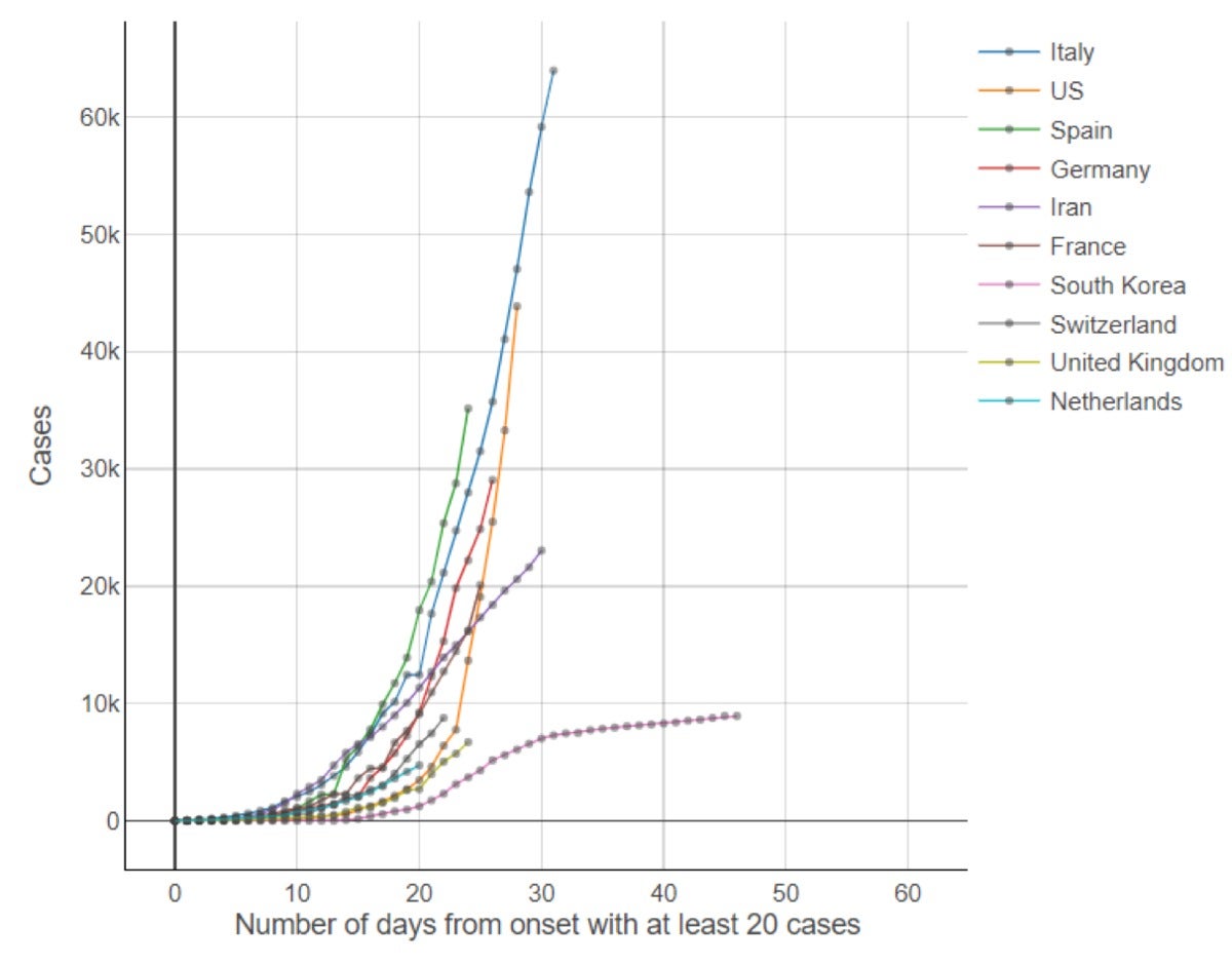
Comparing COVID-19 curves across countries
Another popular chart that has been visible on the internet in the past few days was produced by Mark Handley and is available on his Twitter account.
It’s a line plot of cumulative numbers where the time on the x-axis has
been normalized as the number of days from the onset of the epidemic in
the countries. Considering time zero as the time when the first
COVID-19 cases were confirmed in each country, the curve is subsequently
plotted over the number of days from that time zero. The advantage of
such a view is the overlapping of the curves as if they were evolving at
the same time. It is a way for countries to now learn from the
experience of countries that were affected earlier (Figure 4). KNIME
Figure 4. Cumulative numbers of confirmed COVID-19 cases by day
across 10 of the most affected countries. The time on the x-axis has
been normalized as the number of days from the onset of the epidemic in
each country, which we defined as the first day with at least 20 cases. Mark Handley used this graphic on March 9 to show where
countries like Germany or France were headed if they did not take urgent
containment measures. Indeed, the curves for many European countries
begin just as Italy’s does, which could indicate a similar evolution
unless earlier containment measures are taken. Two weeks later, we can
see that Germany and France continue to follow the early trend set by
Italy, while the U.S. and Spain show even more dramatic growth than
Italy in the early days.
Comparing Italy to South Korea, we can
see that the early start of the epidemic in the two countries is
similar, though South Korea begins seeing a reduction in the growth of
confirmed cases about one month later. According to this graphic, and
assuming that the containment measures have the same effects in both
countries, we can expect the growth to slow in Italy within the next
week. Notice that “assuming that the containment measures have the same
effects in both countries” is a largely unverified assumption, since
Italy has not implemented widespread testing and contact tracing as
South Korea has done.
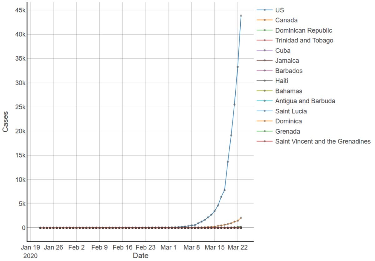
COVID-19 in North America
The most
worrisome curve in North America is for the U.S. (Figure 5a). The fast
spreading of the disease resembles the early data points for European
countries (Figure 4). Notice that as of March 15, the U.S. had only
3,500 confirmed cases, while now, just one week later, the confirmed
cases of COVID-19 are 35,000. A spread factor of 10 in just a week!
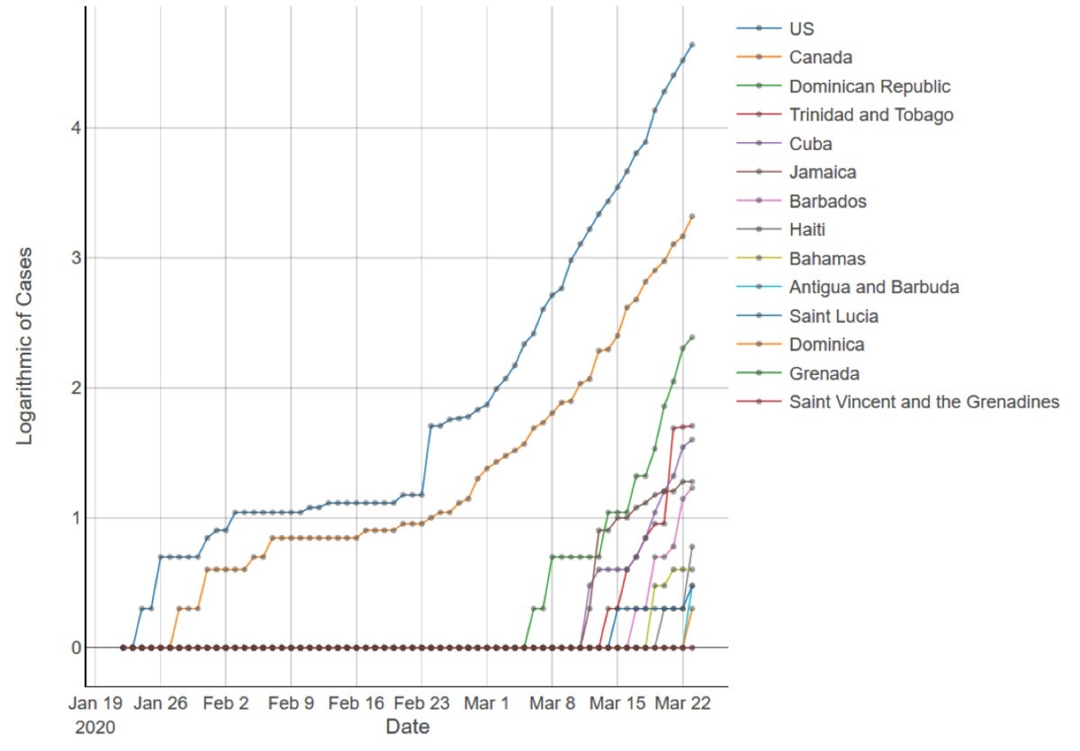
Canada
has smaller numbers of confirmed cases of COVID-19 in comparison to the
U.S. However, if we inspect the logarithmic curve, we can see that the
aggressivity of the disease spread is similar (Figure 5b). KNIME
Figure 5a. Cumulative numbers of confirmed COVID-19 cases in North America. KNIME
Figure 5b. Logarithmic scale of cumulative numbers of confirmed COVID-19 cases in North America.
COVID-19 in Africa, Oceania, and South America
Countries
in Africa, South and Central America, and Oceania are starting to see
the spread of the virus and their first deaths. Isolation measures have
been implemented in most of those countries as well.
COVID-19 around the world
As
we noted at the beginning, the situation worldwide is not improving, as
we’re seeing a steep increase in the number of confirmed cases and
deaths. However, cumulative numbers and the flattening of the curve do
not tell the whole story. We can have a more in-depth look at the
situation by checking the number of new confirmed cases day by day for
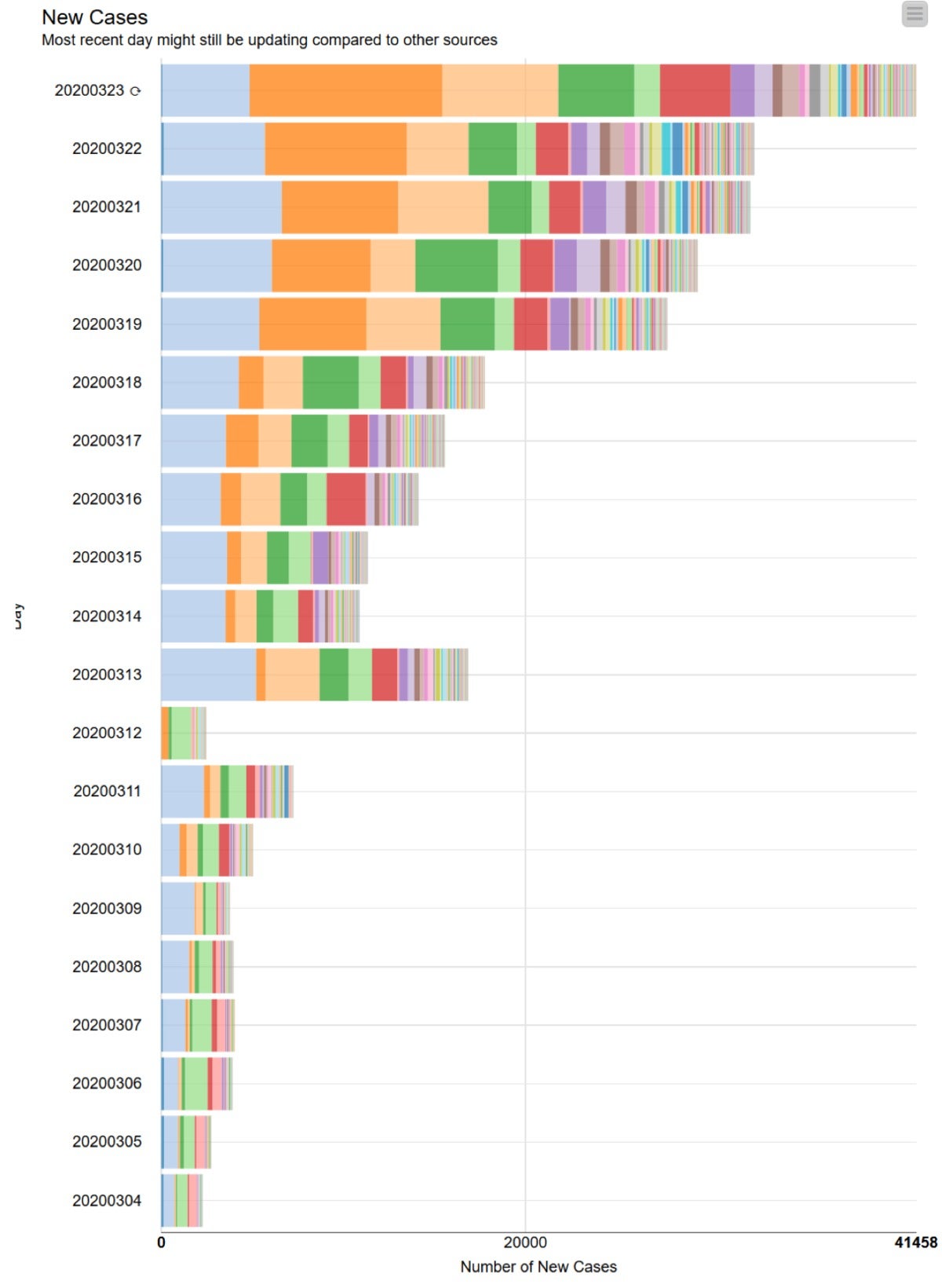
the most affected countries (Figure 6).
Here we can see a first
dramatic jump in the number of confirmed COVID-19 cases around the world
on March 13, 2020. March 12 has incomplete data, which is why the
numbers are smaller than expected. The second big jump in the number of
confirmed new cases took place on March 19, mainly due to the large
increase in cases in the U.S. (bright orange) and Spain (light orange).
New confirmed cases in Italy (light blue) seem to remain constant day
after day, which could be taken as a good news. Also, the number of new
confirmed cases have become negligible for China and South Korea, which
explains the flattening of Korea’s cumulative curve in Figures 2a and
2b. KNIME
Figure 6. Daily numbers of new confirmed cases of COVID-19 in the
most affected countries: Italy (light blue), U.S. (bright orange), Spain
(light orange), Germany (bright green), Iran (light green), France
(red), etc.
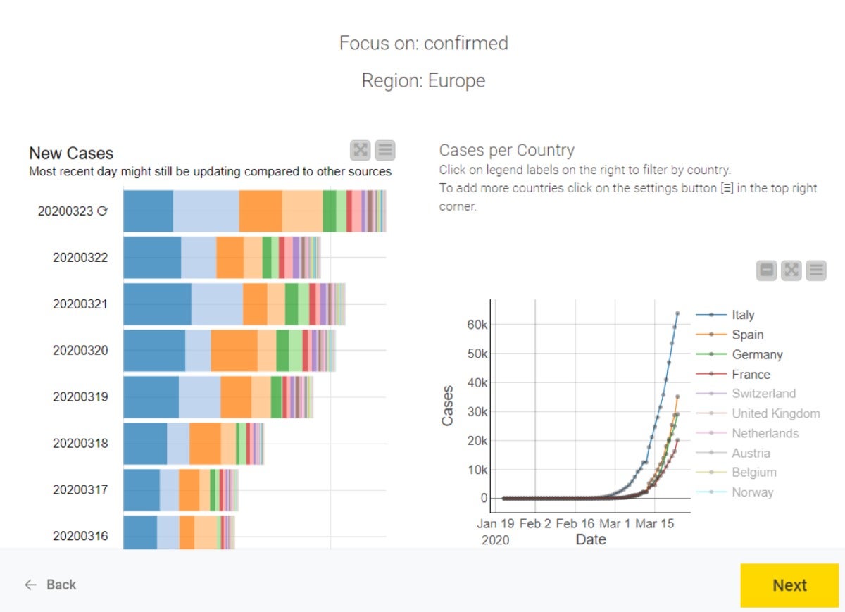
A web application for COVID-19 analysis
Finally, let’s try to put aside the pandemic for a moment and look at how we implemented this web application using guided analytics.
It consists of two pages. The first page shows the general line plot of
confirmed cases, deaths, and recoveries worldwide (displayed in Figure
1). Here, we can also select the type of analysis we want to perform:
worldwide or for a specific continent; counting the number of confirmed
cases, deaths, or recoveries.
By clicking “Next” in the lower
right corner of the page, we move to the second page of the web
application (Figure 8). This is where you will find all the subgraphics
we showed in Figures 2, 3, 4, 5, and 6 as well as a choropleth on a
world map. All plots are interactive. You can add and remove countries
to and from the list, zoom in and out of sections of the plot, select
data points, and show the same data points in all other plots as well. KNIME
Figure 8. Second page of the web application to visualize worldwide
COVID-19 data. This is where the plots and charts described above are
displayed. In this case, we see the dashboard for European countries
only. No coding was required to develop this application. The KNIME workflow for implementing this web application, COVID-19 Live Visualization using Guided Analytics (Figure 9), can be downloaded from the KNIME Hub.

 KNIME
KNIME

 KNIME
KNIME
 KNIME
KNIME
 KNIME
KNIME
 KNIME
KNIME
 KNIME
KNIME
 KNIME
KNIME
 KNIME
KNIME
 KNIME
KNIME
 KNIME
KNIME
Comments
Post a Comment